
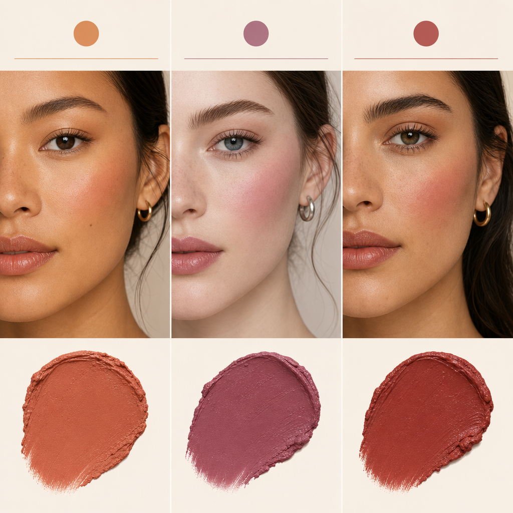
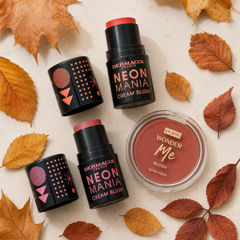
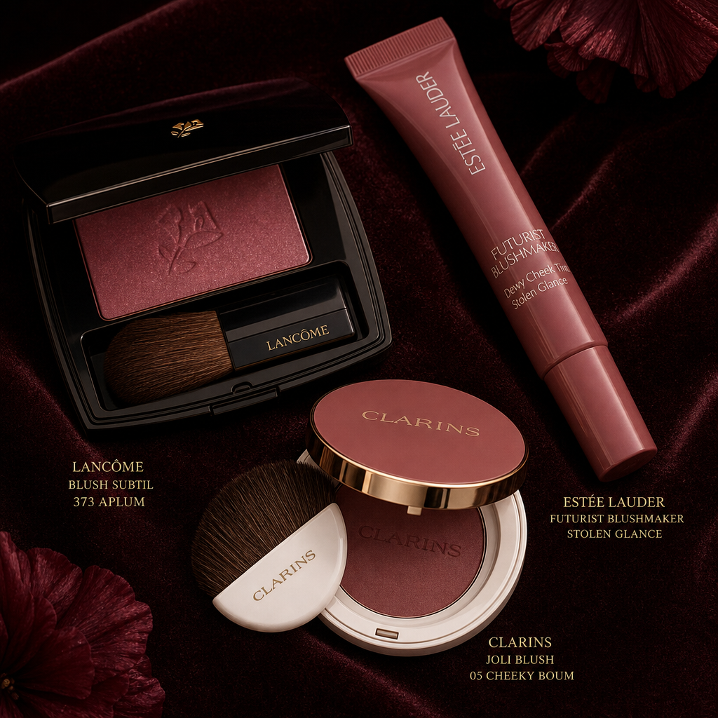

Autumn brings warmer terracotta, brick, and plum blush shades that perfectly complement richer lip and eye makeup. We've selected tips across price ranges – from affordable to luxury brands.
Autumn Blush Palette: Terracotta, Brick, and Plum
Autumn changes the light before you even have a chance to switch your wardrobe. The sun sits lower, daylight takes on a cooler, grayer tone, and skin that looked warmly healthy in August turns pale within weeks. This is when you realize that the blush that worked as a light touch of freshness all summer either disappears on your cheeks or stands out as an inappropriate pink blotch.
The reason usually isn't the product but the contrast. Cool, pure pink and raspberry shades rely on the contrast with warm skin and sharp summer light – once these fade, they leave a flat, slightly grayish impression. Warmer pigments, on the other hand, complement the colors around you and on you: warmer makeup shades, darker lipsticks, wool, and leather in your wardrobe.
The autumn palette revolves around three shade families:
- terracotta – a warm, orange-tinged shade reminiscent of a light tan, keeping the makeup in a natural range,
- brick – a richer, redder version of terracotta with an earthier, slightly darker hue,
- plum – a cooler tone with a blue-purple undertone, which looks elegant and is more suited for evening makeup.
With autumn, the rest of the makeup changes too, and the blush must respond. Richer lips – burgundy, brick, or deep plum lipstick – carry a lot of color on their own, so the face can only handle a gentle, barely noticeable veil. Conversely, subtle lips in a nude shade or just a simple balm can support a much bolder blush, which then becomes the main color accent of the entire makeup. It works similarly with the eyes: for smoky makeup, choose blush sparingly, while with a simple lined eye, you can afford more.
In the following sections, we'll go through all three shade families step by step, across price levels. More affordable brands like Dermacol or Maybelline make sense when you want to cautiously try a new shade first. Premium and luxury brands like Clarins or Estee Lauder work with more finely graded pigments and textures that blend more easily – you'll notice the difference especially with cream formulas and on drier skin.
Before diving into specific shades, browse the blush category in decorative cosmetics on Brasty – you'll see what palette you're working with this year and what suits you. Then it's just a matter of choosing the family that matches your skin undertone and makeup style, which we explore further in the article.
How to Choose a Shade Based on Your Skin Undertone
Autumn shades look different on every face, and it's not so much the lightness of the skin that makes the difference, but rather its undertone. While the surface tone changes throughout the year (darkening in summer, lightening in winter), the undertone remains the same. It's the undertone that determines whether terracotta will brighten you up or appear as an orange blotch on your face.
Warm, Cool, and Neutral Undertones
A warm undertone has a hint of gold, peach, or olive. A cool undertone appears pinkish to bluish, sometimes with a slightly ashy look. Neutral lies between the two and doesn't lean towards either side, allowing for both warm and cool shades.
You can determine it at home in just a few minutes. Stand by a window in natural daylight, remove your makeup, and follow these three simple guidelines:
- Veins on the inside of your wrist. Greenish veins indicate a warm undertone, blue-purple veins suggest a cool undertone, and a combination of both points to a neutral undertone.
- Gold or silver. If gold suits your skin better, it's likely a warm undertone. Silver is usually more flattering on cool undertones.
- White fabric near your face. Against a pure white scarf, warm skin looks yellowish, while cool skin appears pinkish.
No test is infallible, so consider them together. When two out of three point in the same direction, you have your answer.
Which Autumn Shade Suits Whom
- Warm Undertone – terracotta, apricot, and amber brick tones. They look natural on warm skin, as if it's the color from a walk in the cold.
- Cool Undertone – plum, burgundy, and cooler raspberry. These shades enhance pinkish skin without making it look yellow.
- Neutral Undertone – a brick tone halfway between orange and red. It works both ways and is a safe choice when you can't clearly determine the undertone.
Just as important as the shade name is the intensity of application. Terracotta, which on very fair skin requires just two light touches to look like a natural blush, can almost disappear on darker skin. A simple guideline applies: the lighter the skin, the less product and the gentler the layering. The darker the skin, the richer the pigment – and the more sense it makes to use textures that hold color even in a thin layer.
Texture Matters as Much as Color
Autumn brings the heating season and dry indoor air, so the same shade behaves differently in September than in June. Depending on your skin type, it's worth choosing a different consistency:
- Powder Blush suits oily and combination skin because it also lightly mattifies. On dry skin, it can highlight flakes.
- Cream Blush is great for dry skin during the heating season. It blends with makeup and leaves the face looking fresh rather than matte.
- Liquid Blush is often highly pigmented, so a drop is enough. It sets quickly, forgiving fewer mistakes than cream.
If you're still unsure about your undertone, start with brands that offer a wide range of shades – it's easier to shift by half a tone if the first choice doesn't fit. Dermacol and Max Factor cover a more affordable price range and offer a transition from cool pinks to brick tones. Bourjois and Artdeco belong to a more premium level with finer pigmentation, where you can choose between warm terracotta and cooler plum. Pupa blushes, which aim for a brightening finish, are also an interesting choice.
Your undertone sets the direction and the texture provides the comfort with which you'll wear the blush all day. The rest is a matter of the shade you reach for in the morning for work and the one you save for the evening.
Terracotta and Brick Tones for Everyday Makeup
As the summer tan gradually fades and your skin returns to its natural tone, cool pink blushes are often the first to stop working. While they looked fresh on sun-kissed skin, they can easily appear flat and disconnected on a lighter base. This is where terracotta and brick shades come in – warm tones with an orange to reddish-brown base that visually warm up the face and connect with the color your skin remembers from summer.
Terracotta and brick are not the same, even though they are often used interchangeably in descriptions. Terracotta shades lean more towards orange and burnt clay; they create the impression of a light sun-kissed glow and can handle higher intensity without looking overly made-up. Brick is more settled, with a greater proportion of red and brown, resembling the natural flush of skin after exposure to cold air. For work and everyday wear, terracotta is more forgiving as it brightens; brick is suitable when you want to calm the face and maintain a more subtle overall look.
Why These Tones Work After the Tan Fades
After summer, skin doesn't lose its color evenly. It remains slightly golden on the forehead and nose, while the cheeks fade the fastest – which is why cool pink starts to stand out against the base. A warm blush balances the difference: it adds the yellow-red component to the face that sunlight used to provide naturally. The result doesn't look like makeup but like skin that has just returned from a walk.
Warm blushes do have one weakness. They are close in color to bronzer, and when both products are applied side by side with the same intensity, the face can blend into a single flat surface without depth. A proven solution is to give each a different role. Bronzer belongs where the sun would naturally hit – along the hairline and slightly along the jawline – while terracotta blush stays higher on the apple of the cheek and moves towards the temple. Leave a narrow uncovered strip of skin between the two layers; the difference in color then reads as dimension, not as a uniform mask. If you have a bronzer in a strong chocolate tone, opt for a brick blush – two similarly warm oranges next to each other usually compete.
Brands Worth Noting in This Range
Among the more affordable and mid-range brands in our selection, there are several reliable paths to terracotta and brick:
- Dermacol – a Czech brand with a wide range of shades, suitable if you want to try a new tone without a big investment while staying with a manufacturer you know from foundations and concealers.
- Maybelline – the fastest-growing brand in our decorative cosmetics range with regular new releases; a good choice if you prefer modern, more luminous textures.
- Rimmel London – the most affordable of the mentioned quartet, practical for trying out shades and as a second blush for your handbag.
- Max Factor – a classic mid-range option with a focus on long-lasting wear, making sense for all-day office makeup.
As a named tip for your autumn cosmetic bag, we present Pupa Wonder Me Blush 006 First Kiss-Radiant 4 g. It's among the new releases from Pupa, aiming for a gently illuminated result, and the four-gram packaging is a format you can easily carry in your handbag for touch-ups throughout the day.
Price-wise, most terracotta and brick blushes from these brands remain in the affordable and mid-range bracket, which in our decorative cosmetics is roughly up to one hundred and sixty crowns. An autumn shade doesn't have to be a long-term investment, so you can get both terracotta and brick and decide based on how each suits you in daylight.
Plum Shades from Premium Brands for the Evening
As makeup transitions into the evening, the role of blush changes. During the day, it primarily restores a natural color to the face, but in the evening, it becomes part of the whole composition – complementing a bolder lip, more pronounced eyeliner, or smoky eyelids. Cooler plum and burgundy tones have a deeper, slightly bluish undertone, so alongside a dark lipstick, they don't appear as a foreign element but rather as a continuation on the cheeks.
Plum is also the shade that often causes the most uncertainty. In the palette, it looks dark, and in the pot, it seems like it belongs on a theater stage. In reality, it's a pigment that significantly softens when blended – and this is where the differences between price levels become most apparent.
Plum Blush with a Bold Lip
The guideline is simple: the bolder the lip, the more cautiously you should use blush. If you opt for a long-lasting liquid lipstick, like the Maybelline SuperStay Matte Ink Liquid Lipstick in shade 25 Heroine, keep the plum color on the cheeks just hinted. Conversely, with a more translucent, glossy lip – like the shine from the Clarins Lip Perfector range – the blush can afford to be more noticeable.
- Bold lips and smoky eyes together: minimize the blush and keep it more as a shadow under the cheekbone rather than a colorful area.
- Pronounced eyes, neutral lips: plum can be more prominent, as it represents the color that the lips do not provide.
- Dark lipstick, subtle eyes: choose a plum shade slightly lighter than the lipstick, so both colors don't sound in the same tone.
- Layering: apply in two thin layers instead of one thick one – with intense pigments, it's significantly harder to remove than to add.
What You Really Get for a Higher Price
Premium and luxury level blushes differ from cheaper variants not so much in color as in their behavior on the skin. This is doubly true for plum and burgundy shades, as the cool dark pigment is less forgiving of mistakes than warm terracotta.
- Pigmentation and its controllability: more expensive formulations tend to be more concentrated but also better gradable – you can pick up the color in smaller doses and have greater control over it.
- Blendability: finely milled pigments and softer binders blend more easily into the edges, so there is no harsh transition left on the face.
- Longevity: in evening makeup, the difference is noticeable after four to five hours, when cheaper blushes often fade unevenly.
In our range, this level is primarily represented by Clarins, Estee Lauder, Lancôme, and Benefit, brands that have long stood in the luxury segment of decorative cosmetics. A step lower, in the premium range, you'll find L'Oréal Paris – a compromise for someone who wants a better texture but doesn't want to go for the most expensive shelf. If you plan to wear plum blush mainly with evening makeup and darker lipstick, satin finishes are more forgiving because they don't flatten the face.
When the Investment Pays Off and When a Cheaper Option Suffices
A higher price makes sense when you use blush often and in a more intense application – precisely in evening makeup, where the difference in blendability and longevity is evident.
Conversely, if you're just trying out plum and aren't sure if the cooler tone will suit you, it doesn't make sense to start with the most expensive option. The mid-range in the assortment – for example, Pupa, Maybelline, or Dermacol – serves as a testing ground. You'll find out how intense a shade you can handle, how quickly it fades, and whether you even want to wear plum regularly. Only then does it make sense to move up a price level and buy a shade you already know.
Application Technique, Brushes, and Final Selection
The shade is only half of the result. The other half depends on where you apply the blush, what you use to blend it, and how long it lasts on your skin. Autumn terracotta and plum tones tend to be richer than summer pinks, so they are less forgiving of inaccuracies. However, you can master the technique in just a few mornings in front of the mirror.
Where to Apply Blush
Start with the shape of your face and the highest point of your cheekbone. You can easily find it: place your fingers on your cheekbone and smile – the peak that rises is your starting point.
- Round face – apply the color slightly diagonally from the peak of the cheekbone towards the temple. Avoid a continuous circle on the cheeks, which can make the face appear wider.
- Long face – apply the blush more horizontally across the cheekbones; a horizontal stroke balances the length of the face.
- Square face – soften the line by placing the color a bit higher and blending it in a circular motion towards the outer corner of the eye.
- Heart-shaped face – focus on the center of the face and keep the lower part lighter.
Layering Cream Textures
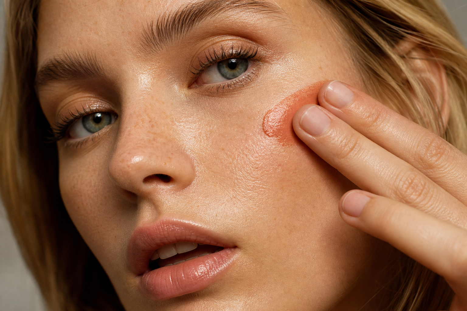
Cream blushes behave differently than powders. They should be applied on finished makeup before setting it with powder – on powdered skin, they blend unevenly and leave spots. Apply in thin layers: first, apply a small amount to the back of your hand, then gently tap the color onto your face with your fingers or a sponge, and add more if necessary. Build richer plum shades gradually – one heavy brush stroke is hard to undo.
Brush or Sponge?
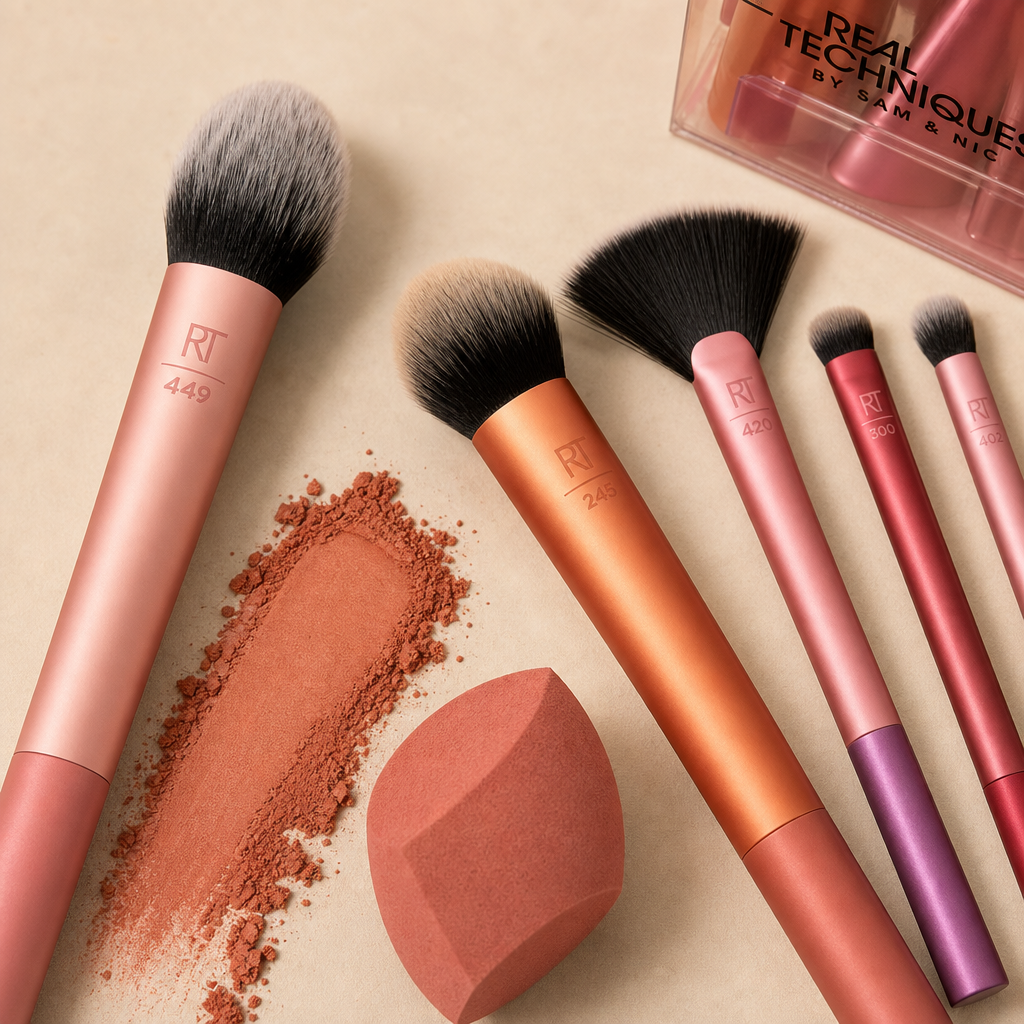
A brush gives control, a sponge gives blending. For powder blushes, choose a brush with a domed or slightly angled top: it picks up the right amount of product and spreads the color in a soft arc. Three tools from the catalog are recommended:
- Real Techniques Expert Face Brush – a dense domed brush that applies color quickly and confidently. Ideal for when you're in a hurry in the morning.
- Real Techniques Blend + Blur Contour Brush – a narrower and flatter shape for precise color application along the cheekbone and for softening transitions.
- Real Techniques Everyday Essentials 5 pcs – a set for those starting from scratch and wanting to cover makeup, blush, and powder in one purchase.
A sponge is suitable for cream textures. A damp sponge reduces intensity as it absorbs some of the product – use this when the color appears more intense than expected.
How to Keep the Result All Day
Powder blush on oily skin lasts longer if you apply a thin layer of translucent powder underneath. Fix cream blush the opposite way, from above: lightly powder it and finish with a setting spray, such as L'Oréal Paris Infaillible 3-Second Setting Mist. Hold the spray about thirty centimeters from your face and let it dry naturally.
Three Seasonal Tips by Budget
If you want to wrap up autumn with a single purchase, choose from three tiers:
- Affordable option – a powder blush in a brick tone from Rimmel London or Maybelline. Both keep prices in the lower range and the shades are versatile enough for everyday wear.
- Mid-range – Pupa Wonder Me Blush 006, a blush with a subtle illuminating effect that places a warm tone on the cheekbone, suitable for work and afternoon coffee.
- Luxury tip – a blush from the Clarins or Estee Lauder portfolio. You'll pay more, but in return, you get carefully graded shades and packaging that works well even outside the home.
You can find the complete offer in the blush category, and tools among the face brushes. It's worth ordering both at once – even a well-chosen blush looks as good as you can blend it.


Category
Recommended articles

"Give a girl the right shoes and she can conquer the world!" Marilyn Monroe